Realistic layout
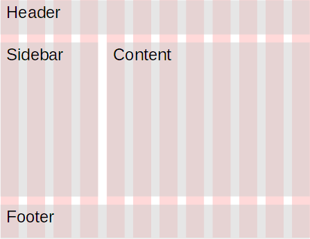
We want a site with a header, a sidebar, a content area, and a footer. like this:

Here's the code for a non-responsive version.
- <body>
- <div class="container">
- <!-- Header -->
- <div class="row">
- <div class="col-12">
- <p class="h1">Doggo World</p>
- </div>
- </div>
- <div class="row">
- <!-- Sidebar -->
- <div class="col-4">
- <ul>
- <li>
- <a href="Home page URL">Home</a>
- </li>
- <li>
- <a href="Blog page URL">Blog</a>
- </li>
- <li>
- <a href="Store page URL">Store</a>
- </li>
- </ul>
- </div>
- <!-- Content -->
- <div class="col-8">
- <h1>Are doggos the best?</h1>
- <p>Doggos are the <em>best!</em></p>
- </div>
- </div>
- <!-- Footer -->
- <div class="row">
- <div class="col-12">
- <p class="small">
- No rights reserved.
- </p>
- </div>
- </div>
- </div>
- </body>
You can try it.
Let's make it responsive, on cell phones. On all sizes above extra small, we'll want:

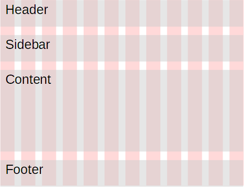
Stacking: header, sidebar, content, footer
First, let's stack the regions up. The sidebar will stretch across, and above the content region, like this:

Here's the code to do it. Just the changes to the earlier code.
- <div class="row">
- <!-- Sidebar -->
- <div class="col-xs-12 col-sm-4">
- ...
- </div>
- <!-- Content -->
- <div class="col-xs-12 col-sm-8">
- ...
- </div>
- </div>
You can try it.
When the window is extra small, both the sidebar and content get 12 grid columns. Each one fills the container, so you get the sidebar, with content below it.
When the window is small or wider, the sidebar gets four columns, and the content gets eight. That's enough to fit in one line in the browser, the they're side-by-side.
Here's what it looks like. On a small screen:

On a very small screen, the same page looks like:


Adela
I just want to check. You changed a few classes, and that's it?
Yes. The stacking thing is pretty easy, and for most sites, it works fine.
Stacking isn't your only option, though. Let's look at a couple of different layout changes we could make for mobile.
Hiding the sidebar
We might decide that users can do without the sidebar on very small screens. BS makes that easy, too.
So, when the screen is small or above, we want:

On a very small screen, we want the sidebar to go away:

Remember, this is the same page. It looks different on different window sizes.
You can try it.
Again, just a few changes to the classes.
- <div class="row">
- <!-- Sidebar -->
- <div class="d-none d-sm-block col-sm-4">
- ...
- </div>
- <!-- Content -->
- <div class="col-xs-12 col-sm-8">
- ...
- </div>
- </div>
d is short for "display" in classes beginning with d-. The format is d-{size}-{visibility}.
For example, <div class="d-md-none"> means "hide the div on a medium-sized display or larger." Doesn't make sense to do that, maybe, but that's what it would do.
<div class="d-lg-none d-xl-block"> means "hide the div on a large display, but show it on an extra large one." block means "show as a block," that is, make it visible.
You would expect that d-xs-none would hide the div when the display was very small, but it looks like that's missing from BS (at the time of writing). You have to use d-none. That works, because the size defaults to xs if you leave it out.
Here's our code for the sidebar:
- <!-- Sidebar -->
- <div class="d-none d-sm-block col-sm-4">
When the display is extra small, hide the sidebar. When the display is small or larger, show the sidebar, and make it four grid columns wide.

Georgina
Sooo cool!
Indeed. BS is amazing.
Changing region order
Last one. On a small or larger screen, you want:

When the same page is on an extra small screen, you want to show the sidebar, but move it after the contents. So the user still has the sidebar if they need it, but they don't have to scroll through it to get to the content.

You can try it.
BS has some ordering classes. Here's the code.
- <div class="row">
- <!-- Sidebar -->
- <div class="col-xs-12 order-last col-sm-4 order-sm-first">
- ...
- </div>
- <!-- Content -->
- <div class="col-xs-12 order-first col-sm-8 order-sm-last">
- ...
- </div>
- </div>
When the screen is extra small:
- The sidebar is 12 columns wide (full container width), and it's the last in its row (that's the
order-last; thexsis missing, but it works). - The content region is also 12 columns wide, and it's the first in its row.
When the screen is small:
- The sidebar is 4 columns wide, and it's the first in its row.
- The content region is 8 columns wide, and it's the last in its row.
Since the sidebar plus the content region are 12 columns wide, they fit side-by-side.
But wait, there's more!
We've talked about some of the most common goals for responsive design: stacking regions, hiding regions, and moving regions. There's lots more you can do, but we won't be talking about any more here. Check the official docs for more.
Up next
Just one more issue for responsive sites: how to make images responsive.