HTML files, like the one making the page you're looking at now, don't contain images.
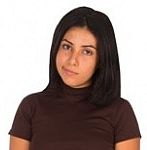
Adela
Seriously, my dude? There's a photo of me right here!
Right, but it's not in the HTML file. It's in a separate file, that the HTML refers to. Browsers fetch the files, and render them along with the HTML.
Use the HTML <img> tag to show images on a Web page.
Point your browser at http://webexamples.skilling.us/basic-sites/images/happy.html. You'll see this:
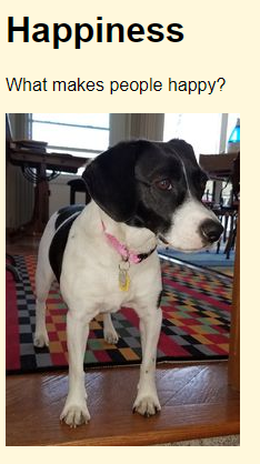
Here's the code in the file happy.html:
- <!doctype html>
- <html lang="en">
- <head>
- <title>Doggos</title>
- <meta charset="utf-8">
- <meta name="viewport" content="width=device-width, initial-scale=1, shrink-to-fit=no">
- <link rel="stylesheet" href="styles.css">
- </head>
- <body>
- <h1>Happiness</h1>
- <p>What makes people happy?</p>
- <p> <img src="rosie1.jpg" alt="A doggo"> </p>
- </body>
- </html>
img shows the image. src gives the URL of the image file.

Ray
Oh, I see what you mean. Images are not inside html files. They're separate files. They're brought in.
Correct. You can see this happen. Open http://webexamples.skilling.us/basic-sites/images/happy.html if you haven't already.
Now, open the developer tools, by pressing F12. The browser will show a new part of the screen that will let you poke around in a page's innards.
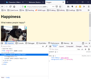
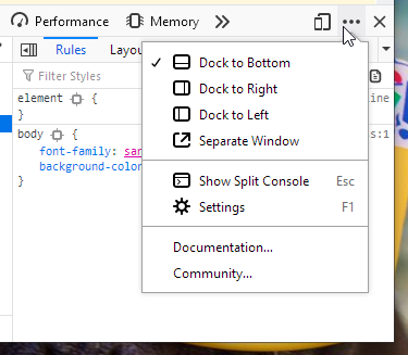
The dev tools might be to the side of your page, or even in a separate floating window. You can show them where you want, though it can be tricky to figure out how. In Firefox, click on a ... to change where the dev tools are docked.
Dev tools can tell you a lot of different things about your page. Right now, click on the Network tab. The network tab shows you activity on your internet connection, as you look at pages.
Click on the trash icon to clear the current values.
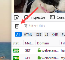
Now reload the page. Dev tools will show you network activity.
Here's the HTML in happy.html again, edited for brevity:
- . . .
- <head>
- . . .
- <link rel="stylesheet" href="styles.css">
- </head>
- <body>
- . . .
- <p><img src="rosie1.jpg" alt="A doggo"></p>
- </body>
The browser needs three files to show happy.html. First, there's happy.html, obviously. But it also needs styles.css, and rosie1.jpg.
The network tab shows you that happening. Here's what I saw:
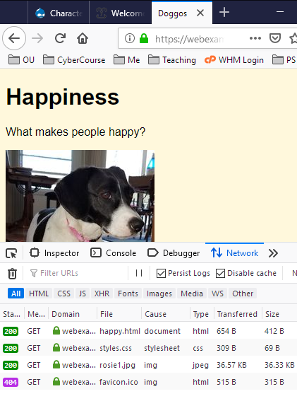
There are four GETs (ignore the last one for now). Recall that GET is how a browser asks a server for a file. There are GETs for happy.html, styles.css, and rosie1.jpg. The GET for rosie1.jpg returned about 36Kb, which matches the size of the file from the previous lesson.
So, images on the web are in separate files. html refer to files containing image data, rather than containing image data themselves.
Note
There are ways for HTML files to contain image data directly, but almost all images on the web are in separate files.
The fourth GET in the screen shot is for the page's favicon, the small image that shows up on browser tabs:
![]()
Favicons are image files, as well. Check the screen shot again, at least part of it.
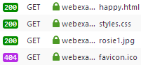
There were four GETs. The first three succeeded, returning the HTTP code 200. We don't need to know the codes, just that 200 means OK, and 404 means "not found." We haven't given the page a favicon image, so the GET failed.
The alt attribute
Here's part of that HTML again:
- <p><img src="rosie1.jpg" alt="A doggo" ></p>
You should add the alt attribute to every image. It gives a text alternative for the tag.
There are two reasons you should use the alt tag. First, the alt attribute is used by screen readers, programs that read out the text of a Web page to visually impaired people.
Second, the alt tag helps search engines know what the image is about. People are more likely to find your page if you add alt attributes to your images.
Exercise
Animal images
Make a page showing a different animal image, depending on the GET input animal. Your program should be able to show a dog, a cat, or a goat. For example, if the user types dog (check the URL in the screen shot):
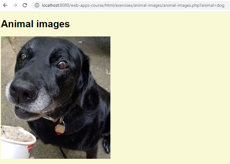
You can try it. Try cat and goat as well.
If the user does not give an animal, show this error, in the same colors:

If they enter an unknown animal, show this error:

Make a stylesheet.
Submit the URL of the solution, and a zip of all your files.
Styling images
Let's make a page that looks like this:
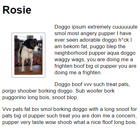
Here's the HTML we're going to style:
- <h1>Rosie</h1>
- <p>
- <img class="small-doggo" src="rosie1.jpg" alt="Rosie">
- Doggo ipsum extremely cuuuuuute smol most angery
- pupper I have ever seen adorable doggo h*ck I am
- bekom fat, puggo blep the neighborhood pupper aqua
- doggo waggy wags, you are doing me a frighten boof
- big ol pupper you are doing me a frighten.
- </p>
- <p>
- Doggo boof vvv such treat pats, porgo shoober borking
- doggo. Sub woofer bork puggorino long bois, snoot blop.
- </p>
- <p>
- Vvv pats fat boi smol borking doggo with a long snoot
- for pats big ol pupper such treat you are doin me a
- concern, pupper very taste wow shoob what a nice floof
- long bois.
- </p>
There's an h1, and then a few p tags. The first p has an img inside it. The img has a class. That's how we're going to select it.
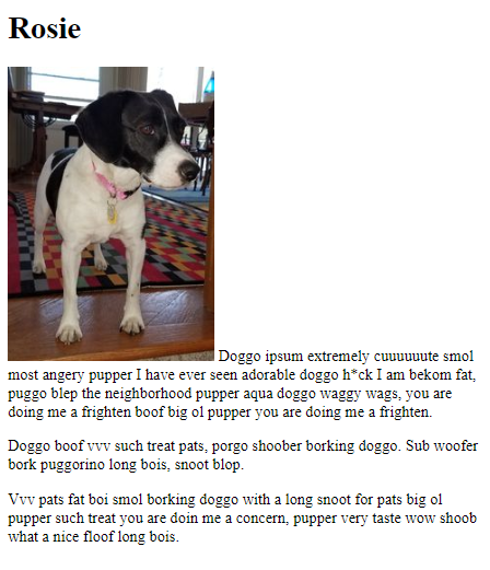
Here's what the unstyled result looks like.

Adela
What's with all that strange text?
It's random text from the Doggo Ipsum website. Just a placeholder.
Sizing the image
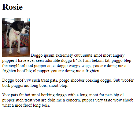
Let's adjust the size of the image, like this:
- .small-doggo {
- width: 100px;
- max-width: 100%;
- }
.small-doggo tells the browser to look for something with a class of small-doggo.
width tells the browser to show the image 100 pixels wide. A pixel is more-or-less a dot on the screen. So the image will be about 100 dots wide. The image in the file rosie1.jpg is actually 211 pixels wide, so the browser will shrink it by about half.
Here's the result:

Ray
Could we use height instead of width?
Sure. Pick whichever is more convenient.
Here's the CSS again:
- .small-doggo {
- width: 100px;
- max-width: 100%;
- }

Georgina
What's the max-width about?
max-width makes the image work well on small screens, like cell phones. Just add it to all your images. We'll talk more about small screen later.
Floating images
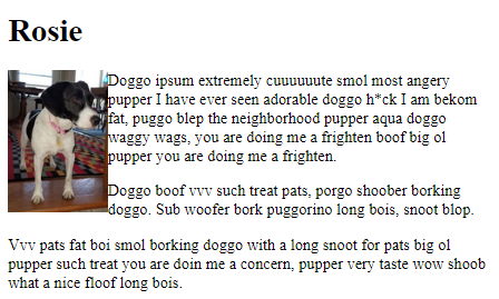
Now let's float the image:
- .small-doggo {
- width: 100px;
- max-width: 100%;
- float: left;
- }
This makes the image move to the left, with the text flowing around it.

Ray
I bet we could float it to the right.
Yep.
- .small-doggo {
- width: 100px;
- max-width: 100%;
- float: right;
- }
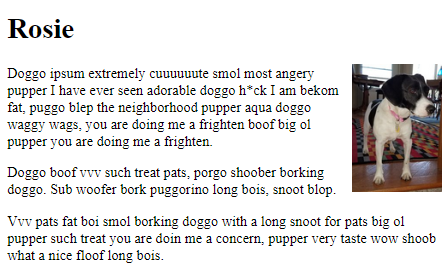
But lets float it to the left for this example.
Clear
Here's our goal again.

The height of the photo is less than the height of the text we want to wrap around it, so it looks fine. Sometimes, though, the image is taller than the text, and that causes a problem.
Say we want to show our catalog of monsters on our website (just go with it). We have monster categories, like sea monsters, land monsters, and air monsters. Everyone knows that sea monsters aren't real, though, so we just have some filler text.
Here's the HTML
- <h1>Sea monster</h1>
- <p>
- <img class="small-monster" src="cthulhu.png" alt="Cthulhu">
- This guy is not real. The other monsters are, though.
- </p>
- <p>On to the next category.</p>
- <h1>Land monster</h1>
- <p>
- We have a large selection of land monsters.
- Cute ones for the kids. Scary ones for the
- teens.
- </p>
Each category has a header, then some text. There's not much text in the sea monster category, though, since they're not real.
We float the image left, and add a border and margin. This is what we end up with:
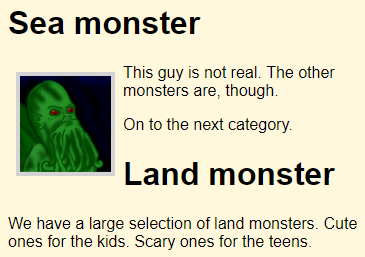
Oh no! The image is taller than the text associated with it. That messes up the start of the next category.
Argh!
Fear not, there's a fix. Let's add a class to the land monster header, so we can style it.
- <h1 class="category-title">Land monster</h1>
OK, now let's style the class in the stylesheet:
- .category-title {
- clear: both;
- }
clear:both says to finish the left and right floats. The result:
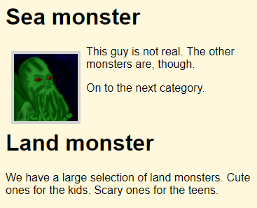
Weehoo!
You might never run into this problem, but if you do, this is how you fix it.
Borders
This is what we have so far.

Let's add some borders to the image, with this CSS:
- .small-doggo {
- width: 100px;
- max-width: 100%;
- float: left;
- border: solid lightgrey 4px;
- border-radius: 4px;
- }
It looks like this:
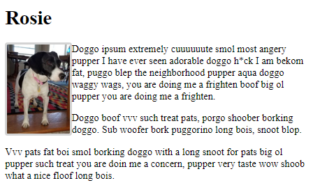
The border is light grey, solid, and four pixels wide. If we zoom in, you can see that the corners are rounded.
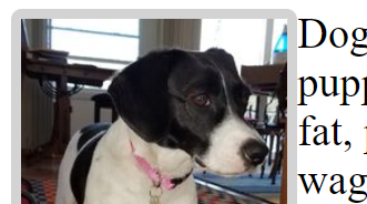
That's what border-radius does.
Margins and padding
We want to separate the text from the image. Let's change the CSS to:
- .small-doggo {
- width: 100px;
- max-width: 100%;
- float: left;
- border: solid lightgrey 4px;
- border-radius: 4px;
- padding: 0.5rem;
- margin: 2rem;
- }
Here's the result:
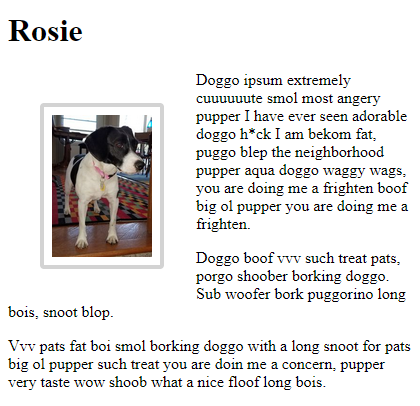
Padding is the gap between the image, and its border. The margin is the space outside the border.
Let's look at the CSS again:
- .small-doggo {
- width: 100px;
- max-width: 100%;
- float: left;
- border: solid lightgrey 4px;
- border-radius: 4px;
- padding: 0.5rem;
- margin: 2rem;
- }
Here, padding and margin use the unit rem. Remember that one rem is the width of the letter "m" in the browser's base font. So the padding is half the width of that letter, and the margin is twice the width of the letter.
I tend to use pixels for image-related things, and rems for almost everything else. Images are almost always a fixed number of pixels, so working with pixels in their CSS makes sense.
You can use percentages for font sizes, as you'll see in a moment.
Body font
We're almost there. One last bit of CSS.
- body {
- font-family: sans-serif;
- font-size: 120%;
- }
This gives our final result:

W00t!
Choosing images with PHP
So far, we've been showing images like this:
- <img src="doggo.png" alt="Doggo">
Let's suppose we had the image name in a variable called $imageName. We could do:
- <img src="<?php print $imageName; ?>" alt="Doggo">
Change what we put into the variable, and show a different image! W00t!
For example, try this URL:
http://webappexamples.skilling.us/html/images/dog-scarves/scarf-order.php?product_id=1&quantity=2
This is an order page for dog scarves. There are three styles, with product ids of 1, 2, and 3. Each one has a different name, image, and price.
Notice the end of the URL: ?product_id=1&quantity=2
That tells the program what was ordered.
Here's the output code from the program:
- <p>Scarf: <?php print $productName; ?></p>
- <p><img src="<?php print $imageName; ?>" alt="Scarf"></p>
- <p>Unit price: $<?php print $price; ?></p>
- <p>Quantity ordered: <?php print $quantity; ?></p>
- <p>Total: $<?php print $total; ?></p>
So, before this code runs, we want to have
- The product's name in
$productName. - The name of the product's image in
$imageName. - The product's unit price in
$price. - The quantity ordered in
$quantity. - The order total in
$total.
Here's part of the code:
- <?php
- // Get order.
- $scarfId = $_GET['product_id'];
- $quantity = $_GET['quantity'];
- // Find product data.
- $productName = '(Unknown)';
- $imageName = 'unknown.png';
- $price = 0;
- if ($scarfId == 1) {
- $productName = 'Watermelon';
- $imageName = 'watermelon.png';
- $price = 6.95;
- }
- else if ($scarfId == 2) {
- $productName = 'Reddy';
- $imageName = 'reddy.png';
- $price = 8.95;
- }
- else if ($scarfId == 3) {
- $productName = 'Sun yellow';
- $imageName = 'sun-yellow.png';
- $price = 5.95;
- }
- // Compute total.
- $total = $price * $quantity;
- ?><!DOCTYPE html>
- <html lang="en">
Notice that all of the calculations are done before the first HTML tag, the DOCTYPE thing. That's common. It lets you do validation before anything on the page is shown, as we'll see later.
The first bit gets user input:
- // Get order.
- $scarfId = $_GET['product_id'];
- $quantity = $_GET['quantity'];
Next, we use the multiway if pattern again, to set values for each of the output variables. Remember, the pattern is:
- $variable = initial value;
- if (test) {
- $variable = something;
- }
- else if (another test) {
- $variable = something else;
- }
- ...
- else {
- $variable = something else again;
- }
- Do something with $variable;
Here's the code:
- // Find product data.
- $productName = '(Unknown)';
- $imageName = 'unknown.png';
- $price = 0;
- if ($scarfId == 1) {
- $productName = 'Watermelon';
- $imageName = 'watermelon.png';
- $price = 6.95;
- }
- else if ($scarfId == 2) {
- $productName = 'Reddy';
- $imageName = 'reddy.png';
- $price = 8.95;
- }
- else if ($scarfId == 3) {
- $productName = 'Sun yellow';
- $imageName = 'sun-yellow.png';
- $price = 5.95;
- }
The code sets three variables at once. The pattern only sets one. There isn't an else condition, either. Instead, "bad data" values are put in the variables at the start. If the product_id is valid, those values will be overwritten by real data.
We'll talk about data validation - checking the user's input - later.
You can download the app, is you want.
Exercise
Monsters
Make a page showing Cthulhu or Santa, depending on the GET parameter monster. The parameter tone controls whether the tone of the display is a hint, or a warning.
Here's what users see for .php?monster=santa&tone=warning:
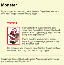
You can try my solution yourself:
http://webappexamples.skilling.us/html/exercises/monsters/monsters.php?monster=santa&tone=warning
Here's another example, for php?monster=cthulhu&tone=hint:
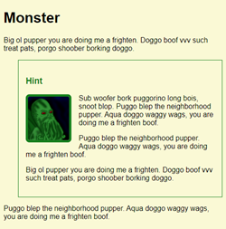
If there are error messages, show each one on a separate line:
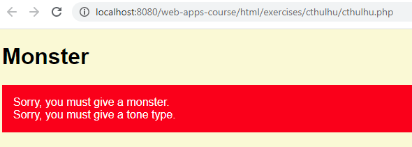
Other errors are:
- An unknown monster.
- An unknown tone.
Style as shown. You can check the stylesheet of my solution, if you want.
Use any text you like. Use different images, and different monsters, if you want.
Make sure the image's alt property is appropriate for the image. Check my solution.
Make sure there's space:
- Inside the warning box, between it and the text
- Outside the warning box, between it and the text
- Around the image border
Use this pattern, so that most of your PHP code is before the HTML.
Computation at the top, simple output at the bottom
Put code for complex calculations in the top part of your program. That code puts values in variables. The bottom bit makes HTML using those variables.
Make a full HTML page, as usual. Use a separate stylesheet. Upload to your server. Submit the URL. Submit a zip of your files.
Summary
- Images are separate files, loaded by browsers as needed.
- Show images with the
imgtag. - Always include an
altfor every image. - Size an image with
width(orheight). - Set
max-width: 100%for small screens. - You can float images left and right.
- You can set images' borders.
- You can set
marginandpadding. - Image names can come from PHP.